Creating dashboards
Create a dashboard that gathers analyses such as metrics, funnels, trends, and so on. The dashboard can display general data or dynamic data such as the values of parameters, for example, a message ID, customer ID, product ID, and so on.
Requirements
- You must implement a tracking code into your website.
- You must be granted a set of user permissions that allow access to the Analytics module and creating analyses.
Creating a dashboard
- Go to
 Analytics > Dashboards > Add dashboard.
 - Enter the name of the dashboard.
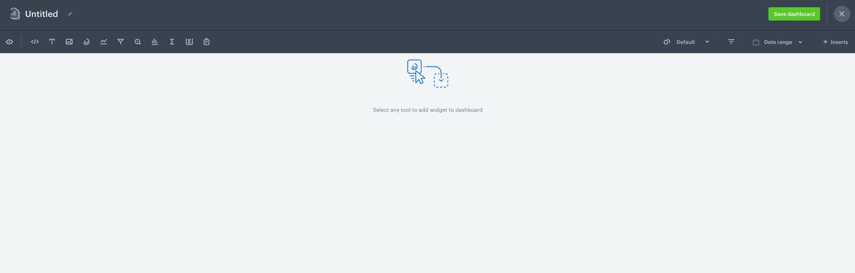
- To add a widget to the dashboard, click an icon on the
 panel. The icons are (left to right): HTML code, text field, image, segmentation, trend, funnel, metric, histogram, aggregate, expression, and a report.
 - To use inserts in HTML code:
- Open the list of inserts.
- Copy the URL of an insert.
- Include the following element in the HTML code:
<img src="url-of-the-insert" />
The insert usage is restricted to images and blocks.
Result: A widget appears on the dashboard.
Configuring analyses widgets
-
If you chose a particular type of an analysis to be added to the dashboard, in order to configure the widget settings, click the widget on the dashboard.
Result: On the right side, a panel shows up with two tabs: Data and Style. -
In the Data panel, enter the title of the analysis.
-
Optionally, in the Description field, to let other users know the purpose of the analysis, enter a short description.
-
From the dropdown list, you can either:
- Select an existing analysis.
- Create a new analysis by clicking Create new at the bottom of the list.
Important: If you want to display dynamic data on the dashboard, proceed to the Dynamic data in dashboards section.
-
You can configure additional settings:
Property name Available in Description Allow overwriting time filters All apart from segmentations By default, the dashboard uses the original time range of the selected analysis. You can use the following options:
- Allow overwriting analytic main time filter - Instead of using time range from main analysis filter, you can either apply the global date range of the dashboard as a main analysis filter of the selected analysis or choose your own date range (use Chart date range field then), which can be different from the one defined in the analysis.
- Allow overwriting all nested time filters - Instead of using time range from nested time filters, you can either apply the global date range of the dashboard as nested time filters or choose your own date range (use Chart date range field then), which can be different from the one defined in the analysis. Enabling this option also enables Allow overwriting time filters.
More information and examples are available in Date ranges in dashboards.Comparison All apart from segmentations The option of comparing the results of the selected analysis to a time range or other analysis. In the case of selecting the time range option, remember it must overlap with the date range set directly in the selected analysis. Goal Metrics, aggregates and expressions The option of setting the desired result. As a result of switching on this option, a progress bar displays in the widget. -
In the Style tab, you can configure the following settings:
Style settingsProperty name Available in Description Visualization type All types of analyses apart from a metric and an expression Select a chart type an analysis is going to be presented in. Appearance All types of analyses Define the unit of results and their accuracy (decimal places). Layout All types of analyses apart from a metric, aggregate and an expression Select a horizontal or vertical layout of a chart. Axes All types of analyses apart from a metric, aggregate and an expression - Define the minimum and maximum values shown on a chart.
- Select the direction of the X and Y axes.
Axes titles All type of analyses apart from a metric, aggregate and an expression Enter titles for X and Y axes. Legend All type of analyses apart from a metric, aggregate and an expression Define the position and alignment of a chart legend. Colorize All type of analyses apart from a metric, aggregate and an expression -
Define the method of coloring the chart elements:
- Full pallet – Every element of the chart has different color.
- Color per series – Chart elements within one unit have different colors (for example, when comparing occurrence of a few events in a particular day).
- One color – Every element of the chart has the same color.
- Min & max values – All chart elements have the same colors apart from those which show the highest and the lowest value.
- Value based – Intensity of the color of the chart element depends on the value.
Color palette All type of analyses apart from a metric, aggregate and an expression Select colors of chart elements. Text A metric, aggregate and an expression - Define the alignment of the result in the widget.
- Select the font size.
Icon A metric, aggregate and an expression Select an icon and its color. The icon is displayed above the title of the widget. Goal colors A metric, aggregate and an expression Define the color of the lowest and the highest result. -
To filter the results of the dashboards, click the
 icon.
icon. -
When you complete creating the dashboard, click Save dashboard.
Tip: By default, a new dashboard is private. If you want to share it with others, check the instruction here.
Dynamic data in dashboards
Dynamic data is a collection of information that refers to a particular entity (for example, a customer, a product, a message sent to customers, a URL, attributes (city, name, birth date), and so on). It’s described as a dynamic because it changes as the context of the analysis changes.
- To display data for an individual customer or attribute on the dashboard, add analyses that contain the same dynamic key.
Result: The icon shows on the settings panel on the dashboard.
 - Click the icon.
Result: A pop-up shows up. The name of the dynamic key that is used in the analyses added is already there.Important: If the value of a dynamic key is not defined, the analyses on the dashboard that use dynamic key show0. - To display the results for a specific value of the dynamic key parameter (for example, a customer), enter the parameter value.
Result: The data in the analyses that contain the same parameter are updated.WARNING: You must be consistent with the names of the dynamic keys while creating analyses that are used in the dashboard. For example,IDandidwill be treated as different dynamic keys. But, the values of the dynamic keys are case-insensitive.
Predefined dynamic keys
There are some predefined dynamic keys which you can use to your advantage:
id- The ID of a communication campaign. You can create analyses dedicated to your campaigns and use theiddynamic key in the conditions of these analyses. Then, you can create a dashboard to contain these analyses. Later on, you can add this dashboard to the statistics of a campaign, so you can check your custom KPIs of campaigns you run.clientId- The ID of a profile. You can create analyses dedicated to measuring customer behavior or other measurable customer-related aspects and use theclientIddynamic key in the conditions of these analyses. Then, you can create a dashboard to contain these analyses. Later on, you can add this dashboard to the statistics in a profile’s card, so you can have all necessary data related to each profile in one place.
Adding dashboards to a profile card
This procedure contains exemplary analyses such:
- as a metric that sums the amount of money a customer has spent so far,
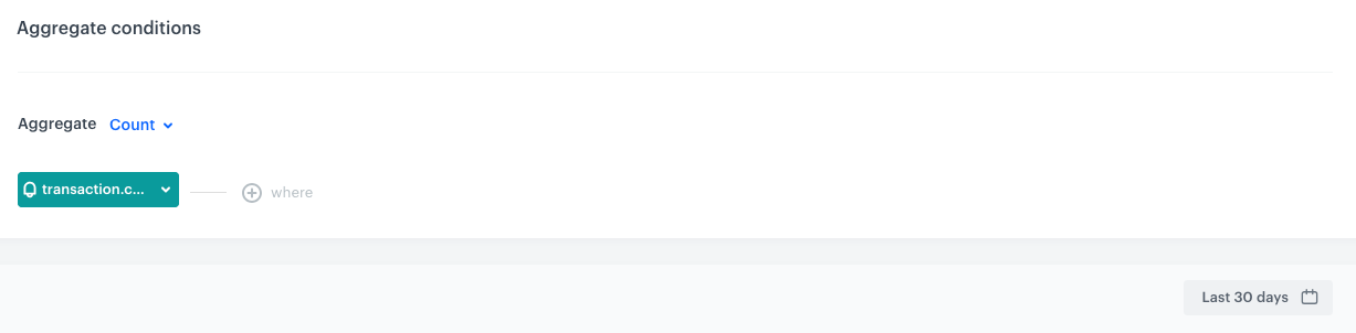
- an aggregate that counts the number of transactions made in the last 30 days
- an aggregate that returns the date of the latest purchase.
These analyses will be used in a dashboard which will be added to the profile cards, so you can check the results of the analyses in the dashboard directly on the card.
- Create a set of analyses that contain the
clientIddynamic key parameter. The value of the parameter can be set to any value.
Important: In aggregates and expressions, theclientIddynamic parameter is added automatically. You don’t need to add it.- Create a metric that returns the amount of money spent so far.
Click here to see the configuration of the metric
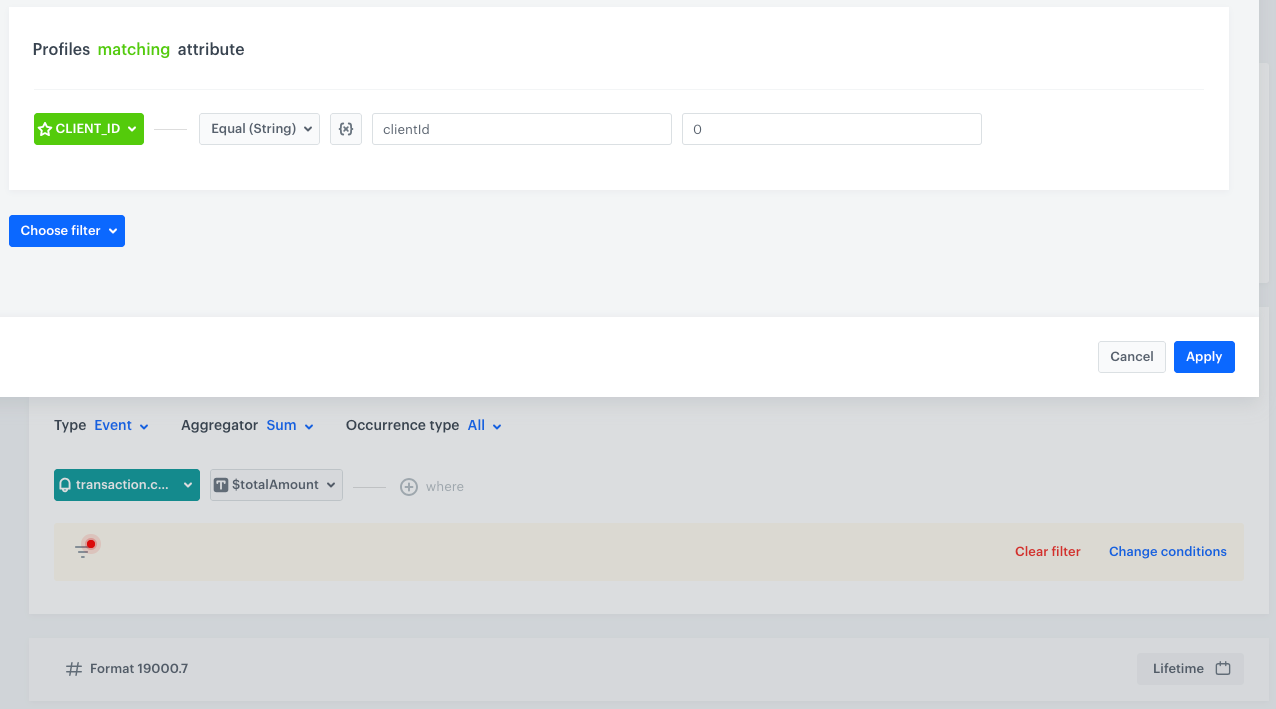
The configuration of the metric that contains dynamic key parameter - Create an aggregate that returns the number of transactions made in last 30 days.
Click here to see the configuration of the aggregate
The configuration of the aggregate that returns the number of transactions - Create an aggregate that returns the date of the latest transaction
Click here to see the configuration of the aggregate
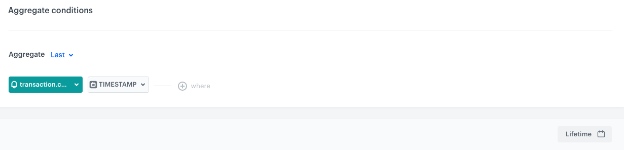
The configuration of the aggregate that returns the timestamp of the latest transaction
- Create a metric that returns the amount of money spent so far.
- Create a dashboard that contains all analyses created in the previous step.
- Go to the Profiles module.
- Select any profile on the list.
- Select the Statistics tab.
- Click the
 icon.
icon.
Result: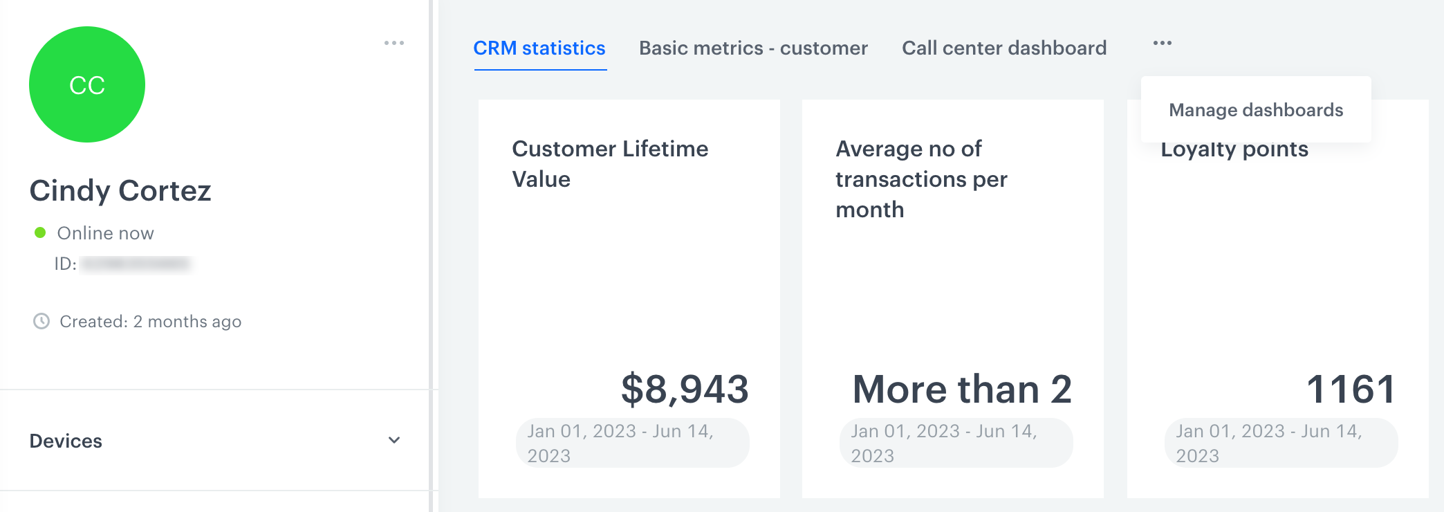
The Statistics section on a profile's card - From the dropdown list, select Manage dashboards.
- On the pop-up, in the text field, enter the name of the dashboard you created previously.
- Confirm your choice by clicking Add.
- Optionally, you can define the order of displaying dashboards by dragging and dropping them in the desired order.
- Confirm the dashboard settings by clicking Apply.
Adding dashboards to campaign statistics
- Create a set of analyses that contain the
iddynamic key parameter. The value of the parameter can be set to any value. - Create a dashboard that contains all analyses created in the previous step.
- Go to the Communication module.
- Select the communication type.
- Go to the details of your active or finished communication campaign.
- Select the Statistics tab.
- Click the icon.
Result: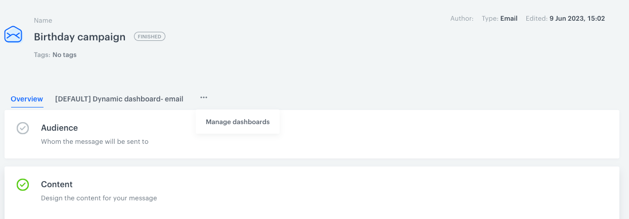
The Statistics section of an email campaign - From the dropdown list, select Manage dashboards.
- On the pop-up, in the text field, enter the name of the dashboard you created previously.
- Confirm your choice by clicking Add.
- Optionally, you can define the order of displaying dashboards by dragging and dropping them in the desired order.
- Confirm the dashboard settings by clicking Apply.