Content Widget (Android)
Content widget is a feature in the Software Development Kit that allows you to embed an easily customizable view with recommendations in your application.
Two view layouts are available:
- Horizontal slider - a single row view that slides horizontally on the screen.
- Grid view - can be displayed as full- or half-screen grid layout within your app.
Both views offer a number of configuration options that allow you to style the view consistently in the app. Additionally, the Content widget automatically tracks 4 events:
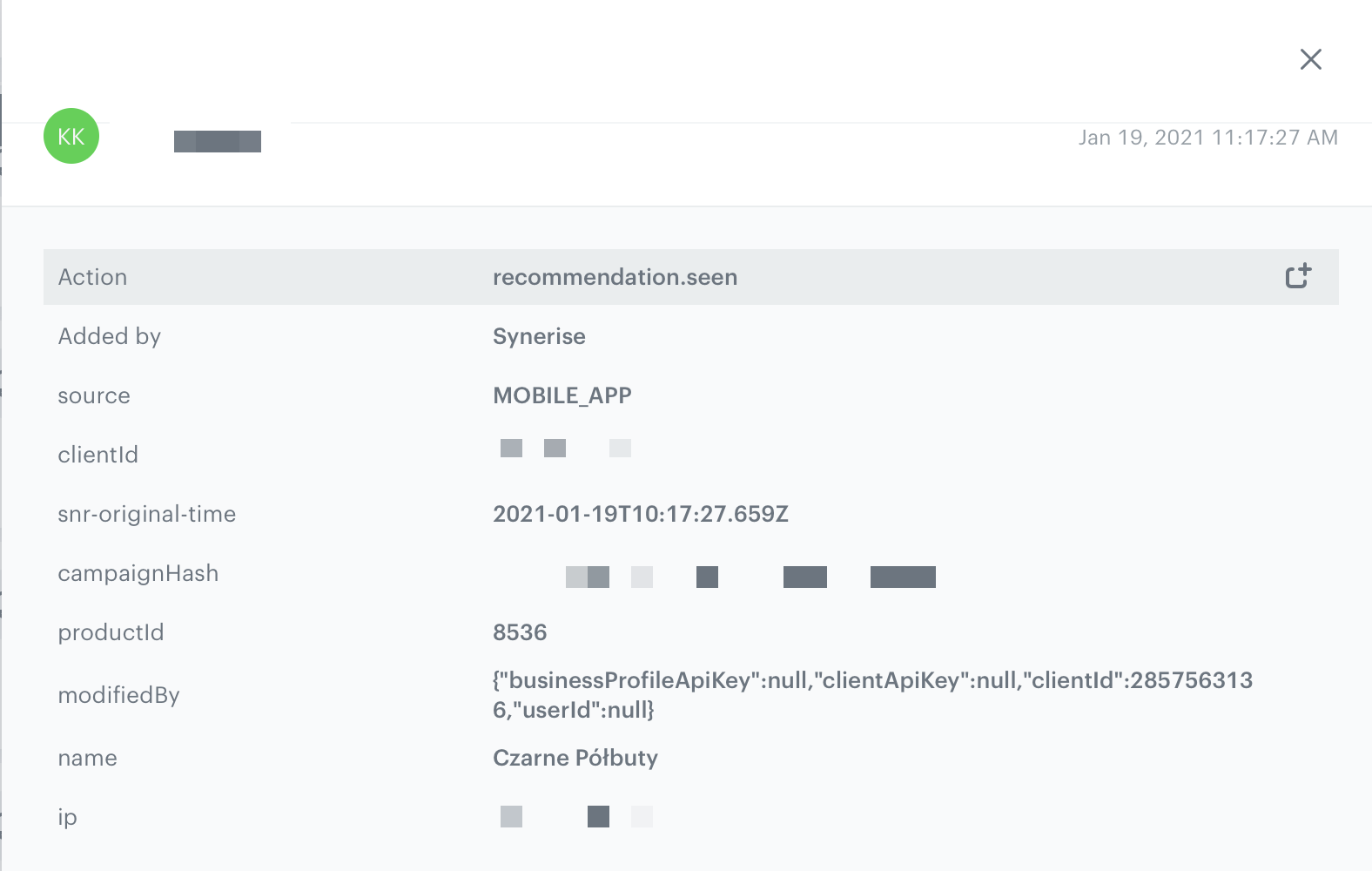
recommendation.seenorrecommendation.view(depending on configuration) sent when a recommended item is visible to the customer.
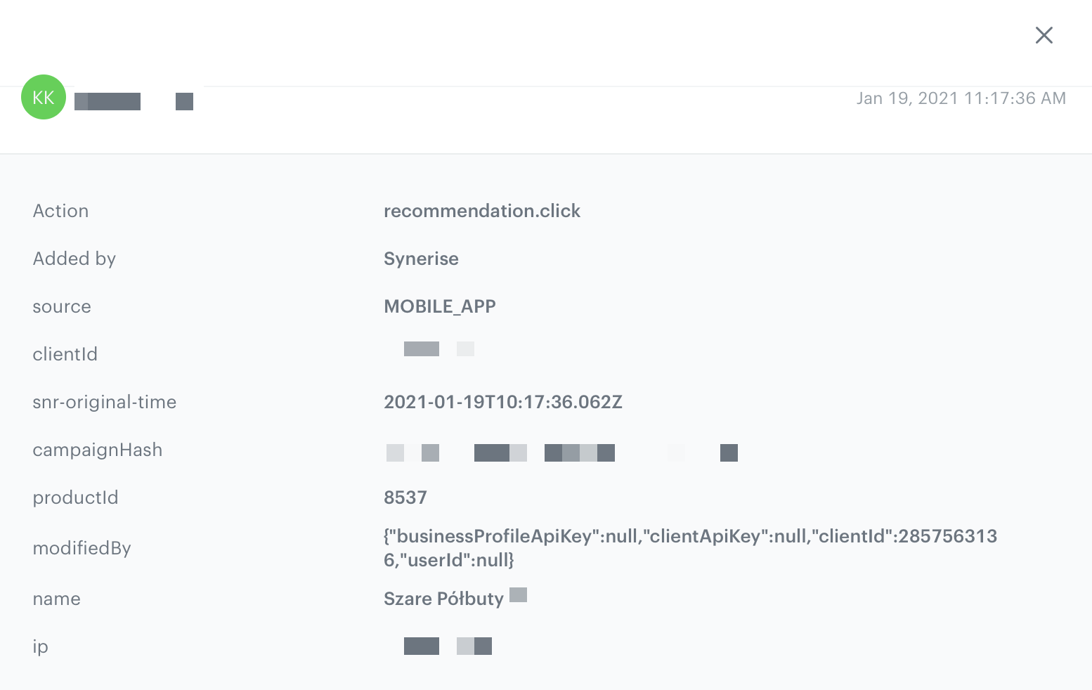
recommendation.clicksent when a customer clicks the recommended item.
product.likesent when a customer clicks a selectable button in the recommendation. (The button must be added)
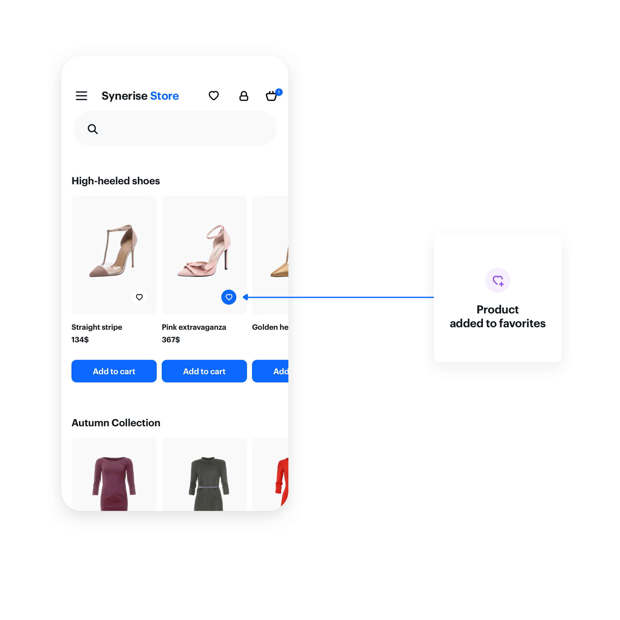
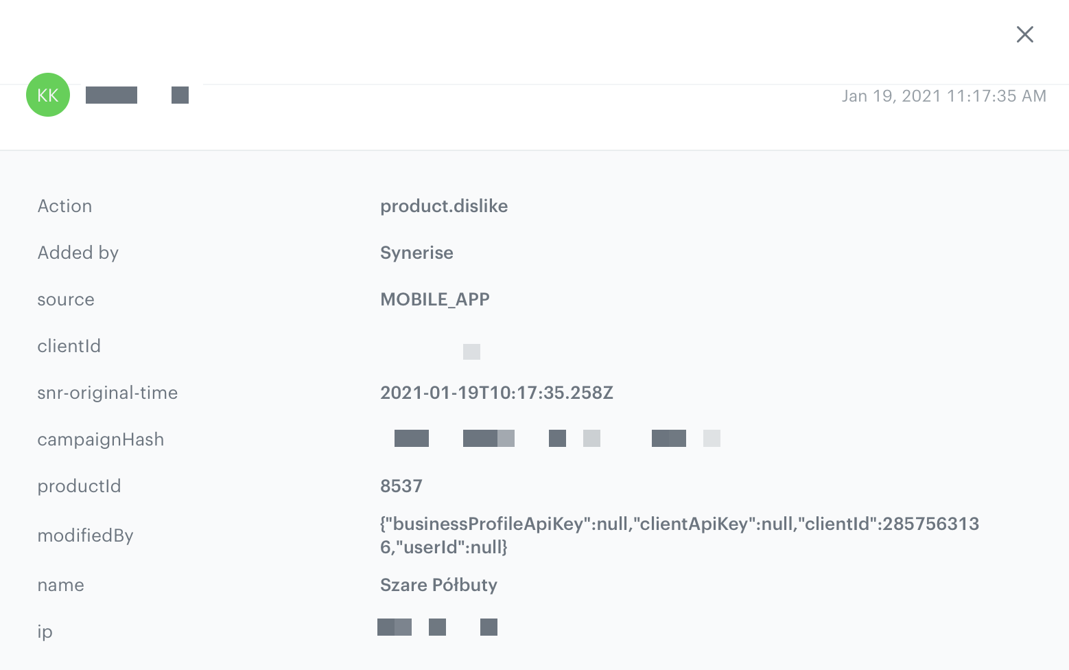
product.dislikesent when a customer clicks a selectable button in the recommendation a second time. (The button must be added)
Prerequisites
To use the content widget feature, you must:
-
Obtain a customer token from Customer Authentication.
-
Create a document.
Such a document should contain the following content:{ "name": "Similar Products", "recommendations": "{% recommendations_json3 campaignId=COhsCCOdu8Cg %} {% endrecommendations_json3 %}" } -
In the notepad, save the document’s slug and the ID of the recommendation for later use.
product-details, menu, and so on.Basic implementation
Configure the ContentWidgetOptions and ContentWidgetAppearance settings first.
| Class | Description |
|---|---|
ContentWidgetOptions |
Contains options for business logic, such as the slug, product identifier, and so on. Read more. |
ContentWidgetAppearance |
Contains the UI configuration. Read more. |
The example below is the most basic implementation.
String productId = "10214";
String slug = "similar";

ContentWidgetOptions options = new ContentWidgetRecommendationsOptions(this, slug, new OnRecommendationModelMapper() {
            @Override
            public ContentWidgetRecommendationDataModel onRecommendationMapping(Recommendation recommendation) {
            // Mapping provided by
            	HashMap<String, Object> data = recommendation.getFeed();
                String imageLink = (String) data.get("imageLink");
                String productName = (String) data.get("title");

                String price = null;
                String salePrice = null;
                try {
                    JSONObject json = new JSONObject(data.get("price").toString());
                    price = json.getString("value");
                    if (data.containsKey("salePrice")) {
                        JSONObject jsonSalePrice = new JSONObject(data.get("salePrice").toString());
                        salePrice = jsonSalePrice.getString("value");
                    }
                } catch (JSONException e) {
                    e.printStackTrace();
                }
                return new ContentWidgetRecommendationDataModel(productName, imageLink, price, salePrice, null);
            }
        });
options.attributes.put(ContentWidgetOptions.ContentWidgetOptionsAttributeKeyProductId, productId);
ContentWidgetItemLayout itemLayoutDetails = new ContentWidgetItemLayout();
ContentWidgetHorizontalSliderLayout layout = new ContentWidgetHorizontalSliderLayout();
ContentWidgetAppearance contentWidgetAppearance = new ContentWidgetAppearance(layout, itemLayoutDetails);
ContentWidget widget = new ContentWidget(options, contentWidgetAppearance);

View view = widget.getView(); // our widget
insertPoint.addView(view); // your view which will receive widget
Widget options
The ContentWidgetRecommendationOptions class is responsible for defining the business logic options of the widget, for example:
- document slug
- product identifier (which is stored inside class instance in attributes HashMap)
- recommendation model mapper
The table explains the parameters that can be configured in ContentWidgetRecommendationOptions.
| Parameter | Type | Default | Description |
|---|---|---|---|
| activity | Activity |
- | Activity to which you insert the widget (must be included) |
| slug | String |
- | Slug responsible for generating data |
| attributes | Hashmap |
- | Custom attributes for generating data |
| mapper | OnRecommendationModelMapper |
- | Mapper responsible for mapping data from feed to contentWidgetRecommendation model |
| recommendationEventType | RecommendationEventType |
- | Recommendation event type.
|
Example
String productId = "10214";
String slug = "similar";
ContentWidgetOptions options = new ContentWidgetRecommendationsOptions(this, slug, new OnRecommendationModelMapper() {
            @Override
            public ContentWidgetRecommendationDataModel onRecommendationMapping(Recommendation recommendation) {
            // here you should implement your mapping to SyneriseModel
            	HashMap<String, Object> data = recommendation.getFeed();
                String imageLink = (String) data.get("imageLink");
                String productName = (String) data.get("title");

                String price = null;
                String salePrice = null;
                try {
                    JSONObject json = new JSONObject(data.get("price").toString());
                    price = json.getString("value");
                    if (data.containsKey("salePrice")) {
                        JSONObject jsonSalePrice = new JSONObject(data.get("salePrice").toString());
                        salePrice = jsonSalePrice.getString("value");
                    }
                } catch (JSONException e) {
                    e.printStackTrace();
                }
                return new ContentWidgetRecommendationDataModel(productName, imageLink, price, salePrice, null);
            }
        });
options.attributes.put(ContentWidgetOptions.ContentWidgetOptionsAttributeKeyProductId, productId);
In order to map your item feed, override
onRecommendationMapping and inside it return ContentWidgetRecommendationDataModel.The configuration of the data frames is available in AI engine configuration. It is defined separately for each item feed.
Appearance configuration
The ContentWidgetAppearance class is responsible for defining the appearance of the widget.
The class consists of parameters that define the widget’s appearance, however, two of them are the most important:
- Main layout class: defines the way of distributing elements in the widget. Currently, two layouts are provided:
ContentWidgetHorizontalSliderLayoutContentWidgetGridLayout
- Item layout class: defines appearance and parameters for the item in the widget. Currently, there is only one layout provided:
ContentWidgetBaseItemLayout.
The table explains the parameters that can be configured in ContentWidgetAppearance.
| Parameter | Type | Default | Description |
|---|---|---|---|
| layout | ContentWidgetBaseLayout | - | Class that inherits from ContentWidgetBaseLayout, contains the UI details of the widget’s layout |
| itemLayout | ContentWidgetBaseItemLayout | - | Class that inherits from ContentWidgetBaseItemLayout, contains the UI details of a single item in a widget |
Layouts
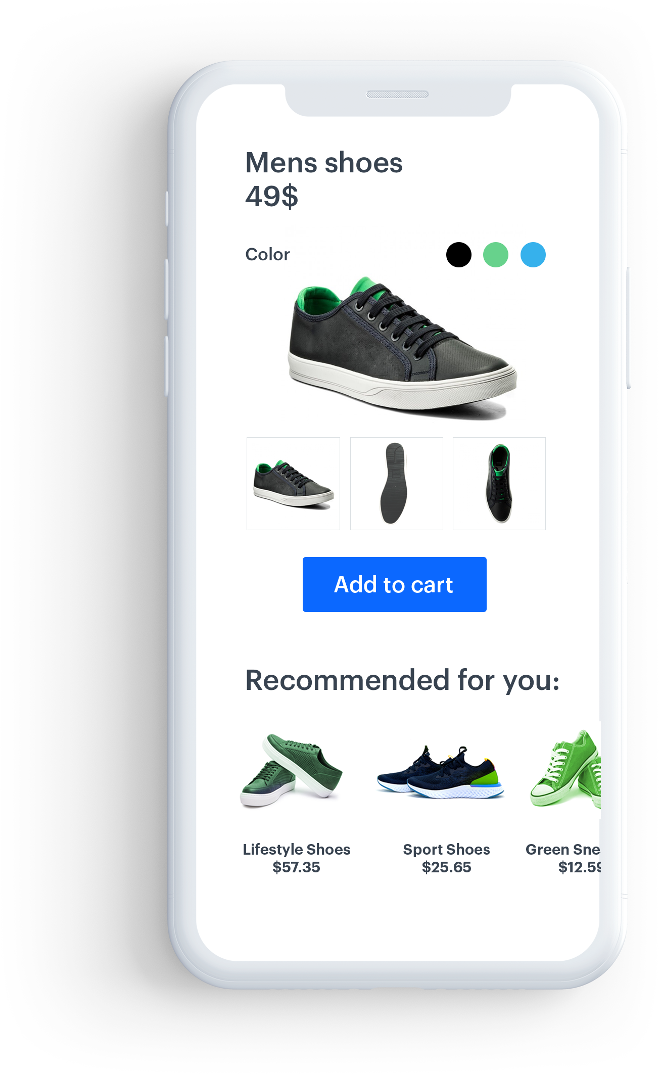
Horizontal slider
This layout is intended to present recommendations in a fixed-hight horizontal scrollable slider.
Each item in the slider is called a card.
Parameters
The table below contains the parameters that can be configured in ContentWidgetHorizontalSliderLayout.
| Parameter | Type | Default | Description |
|---|---|---|---|
| cardViewSize | ViewGroup.LayoutParams |
0 | Size of a single item (cardView). You can provide this parameter in dp (recommended) or px. |
| cardViewHorizontalSpacing | Int |
0 | Horizontal spacing between items. You can provide this parameter in dp (recommended) or px. |
| cardViewBackgroundColor | Int |
#fff | Background color of a cardView |
CardViewSize can be set either by attribution or by a setter.Example
ContentWidgetHorizontalSliderLayout layout = new ContentWidgetHorizontalSliderLayout();

layout.setCardViewSize(250, 300);
layout.cardViewHorizontalSpacing = 15;
layout.cardViewBackgroundColor = ContextCompat.getColor(Synerise.getApplicationContext(), R.color.regent);
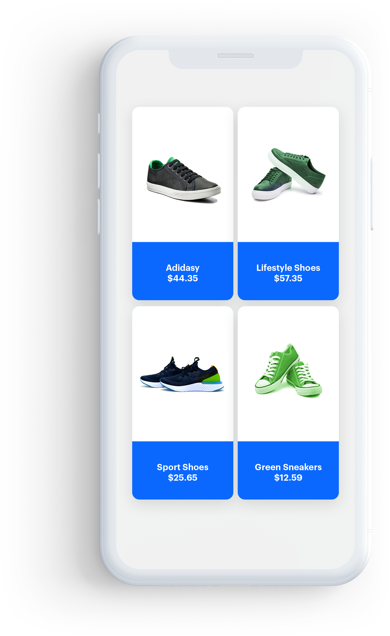
Grid view
This layout presents recommendations in a vertical scrollable grid, with elements organized into columns and rows. You can create a full- or half-screen widget.
Constructor
| Parameter | Type | Default | Description |
|---|---|---|---|
| preferredWidth | Float |
- | Preferred width of your widget. You can pass the width in dp (recommended) or px |
float screenWidthDp = displayMetrics.widthPixels;
ContentWidgetGridLayout layout = new ContentWidgetGridLayout(screenWidthDp);
Parameters
The table contains the parameters that can be configured in ContentWidgetGridLayout.
| Parameter | Type | Default | Description |
|---|---|---|---|
| cardViewSize | ViewGroup.LayoutParams |
0 | Size of a single item (cardView) |
| cardViewVerticalSpacing | Int |
0 | Vertical spacing between items in dp or px |
| cardViewHorizontalSpacing | Int |
0 | Horizontal spacing between items in dp or px |
| cardViewBackgroundColor | Int |
#fff | Background color of a cardView |
| includeEdgeSpacing | Boolean |
false | When true, edge spacing is enabled |
Example
float screenWidthDp = displayMetrics.widthPixels;
ContentWidgetGridLayout layout = new ContentWidgetGridLayout(screenWidthDp);

layout.setCardViewSize(250, 300);
layout.cardViewHorizontalSpacing = 15;
layout.cardViewVerticalSpacing = 20;
layout.includeEdgeSpacing = false;
layout.cardViewBackgroundColor = ContextCompat.getColor(Synerise.getApplicationContext(), R.color.regent);
Basic item layout
This is the basic layout for items. It contains: the image, the title, and the price from the uploaded data.
Parameters
The table below contains parameters that can be configured in ContentWidgetItemLayout.
| Parameter | Type | Default | Description |
|---|---|---|---|
| imageHeightToCardHeightRatio | Double |
0.6 | Image height. A ratio of 0.6 means that the image height equals 60% of the entire height of an item |
| imageWidthToCardWidthRatio | Double |
1 | Image width. 1 means that the image width is equal to the width of the item |
| imageScaleType | ImageView.ScaleType |
ImageView.ScaleType.CENTER_INSIDE | Scaling type of the image |
| imageMargin | Int |
0 | General margin of the image |
| itemLabelStyle | Typeface |
- | Typeface of the label |
| itemLabelSize | Int |
12 | Size of the label |
| itemLabelColor | Int |
#000 | Label text color |
| itemLabelMarginLeft | Int |
0 | Left margin of the label text |
| itemLabelMarginRight | Int |
0 | Right margin of the label text |
| itemLabelMarginBottom | Int |
0 | Bottom margin of the label text |
| itemLabelMarginTop | Int |
0 | Top margin of the label text |
| cardViewCornerRadius | Float |
0 | Corner radius of the cardView |
| cardViewElevation | Float |
0 | Elevation of the cardView |
| itemTitleStyle | Typeface |
- | Typeface of the product title |
| itemTitleSize | Int |
12 | Size of the title |
| itemTitleColor | Int |
#000 | Color of the title text |
| itemTitleMarginLeft | Int |
0 | Left margin of the title text |
| itemTitleMarginRight | Int |
0 | Right margin of the title text |
| itemTitleMarginBottom | Int |
0 | Bottom margin of the title text |
| itemTitleMarginTop | Int |
0 | Top margin of the title text |
| itemPriceStyle | Typeface |
- | Typeface of the price |
| itemPriceSize | Int |
12 | Size of the price text |
| itemPriceColor | Int |
#000 | Color of the price text |
| itemPriceMarginLeft | Int |
0 | Left margin of the price text |
| itemPriceMarginRight | Int |
0 | Right margin of the price text |
| itemPriceMarginTop | Int |
0 | Top margin of the price text |
| itemPriceMarginBottom | Int |
0 | Bottom margin of the price text |
| itemSalePriceStyle | Typeface |
- | Typeface of the sale price |
| itemSalePriceSize | Int |
12 | Size of the sale price |
| itemSalePriceColor | Int |
#000 | Color of the sale price text |
| itemSalePriceGravity | Int |
Gravity.LEFT | Gravity of the sale price text |
| itemSalePriceMarginLeft | Int |
0 | Left margin of the sale price text |
| itemSalePriceMarginRight | Int |
0 | Right margin of the sale price text |
| itemSalePriceMarginTop | Int |
0 | Top margin of the sale price text |
| itemSalePriceMarginBottom | Int |
0 | Bottom margin of the sale price text |
| itemSalePriceOrientation | Int |
LinearLayout.HORIZONTAL | Orientation of the sale price text |
| isItemSalePriceVisible | boolean |
false | Flag determining whether to show the sale price or not |
| itemDiscountPercentageLabelStyle | Typeface |
- | Typeface of discount percentage label |
| itemDiscountPercentageLabelColor | Int |
#000 | Color of discount percentage label |
| itemDiscountPercentageLabelSize | Int |
12 | Size of the discount percentage label text |
| itemDiscountPercentageLabelMarginLeft | Int |
0 | Left margin of the discount percentage label text |
| itemDiscountPercentageLabelMarginRight | Int |
0 | Right margin of the discount percentage label text |
| itemDiscountPercentageLabelMarginTop | Int |
0 | Top margin of the discount percentage label text |
| itemDiscountPercentageLabelMarginBottom | Int |
0 | Bottom margin of the discount percentage label text |
| isItemDiscountPercentageLabelVisible | boolean |
false | Flag determining whether to show the discount percentage label or not |
| itemActionButton | ImageButtonCustomAction |
- | Object which stores all information about the ActionButton |
| itemBadge | ContentWidgetBadge |
- | Object which stores all information about the Badge |
| imageButtonCustomActionGravity | Int |
Gravity.TOP | Gravity of the actionButton |
- You can combine the
Gravity.*parameters. For example, to align an item to top and right, use:Gravity.TOP | Gravity.RIGHT - All text elements are centered horizontally.
public void setItemTitleMargins(int marginLeft, int marginRight, int marginTop, int marginBottom)
Example
ContentWidgetItemLayout itemLayoutDetails = new ContentWidgetItemLayout();
itemLayoutDetails.cardViewElevation = 5;
itemLayoutDetails.cardViewCornerRadius = 10;
itemLayoutDetails.imageHeightToCardHeightRatio = 0.6
itemLayoutDetails.imageWidthToCardWidthRatio = 1;
itemLayoutDetails.imageMargin = 5;
itemLayoutDetails.itemTitleStyle = Typeface.create("sans-serif-condensed", Typeface.NORMAL);
itemLayoutDetails.itemTitleSize = 12;
itemLayoutDetails.itemTitleColor = ContextCompat.getColor(Synerise.getApplicationContext(), R.color.charcoal);
itemLayoutDetails.itemTitleGravity = Gravity.LEFT;
itemLayoutDetails.setItemTitleMargins(10, 0, 0, 0);
itemLayoutDetails.itemPriceStyle = Typeface.create("sans-serif-light", Typeface.BOLD);
itemLayoutDetails.itemPriceSize = 12;
itemLayoutDetails.itemPriceColor = ContextCompat.getColor(Synerise.getApplicationContext(), R.color.charcoal);
itemLayoutDetails.itemPriceGravity = Gravity.LEFT;
itemLayoutDetails.setItemPriceMargins(10, 0, 3, 0);
Interaction with the widget
Public interface
load() - Starts fetching data and creates a view structure of the widget.
getView() - Gets the root view of the whole widget view structure.
onContentWidgetListener is used to inform developers about the state of a widget. Read more below.
Listener
onLoading(ContentWidget contentWidget, boolean isLoading)- Called when the widget loading state changes.onLoad(ContentWidget contentWidget)- Called after the widget is loaded.onLoadingError(ContentWidget contentWidget, ApiError apiError)- Called when an error occurs while loading.onSizeChange(ContentWidget contentWidget, ViewGroup.LayoutParams size)- Called when the widget size changes.onClickActionReceive(ContentWidget contentWidget, BaseModel model)- Called when the customer clicks a widget item.
Image button custom action
ImageButtonCustomAction is used to add imageButton to your widget. You can add a singleStateButton or a selectableButton.
Parameters
The following table contains the parameters that can be configured in ImageButtonCustomAction.
| Parameter | Type | Default | Description |
|---|---|---|---|
| predefinedAction | PredefinedActionType |
null | PredefinedAction determines which event is sent on click |
| marginLeft | Int |
0 | Left margin of the image button |
| marginRight | Int |
0 | Right margin of the image button |
| marginTop | Int |
- | Top margin of the image button |
| marginBottom | Int |
0 | Bottom margin of the image button |
public void setImageButtonCustomActionMargins(int marginLeft, int marginRight, int marginTop, int marginBottom)
The following table contains the parameters that can be configured in ContentWidgetBadge.
| Parameter | Type | Default | Description |
|---|---|---|---|
| textStyle | Typeface |
- | Typeface of the text badge |
| textSize | Int |
12 | Size of the badge text |
| rule | Int |
RelativeLayout.ALIGN_LEFT | Rule deremining position of a badge. Can be ALIGN_LEFT or ALIGN_RIGHT |
| paddingLeft | Int |
0 | Left padding of the badge text |
| paddingRight | Int |
0 | Right padding of the badge text |
| paddingTop | Int |
0 | Top padding of the badge text |
| paddingBottom | Int |
0 | Bottom padding of the badge text |
| marginLeft | Int |
0 | Left margin of the badge |
| marginRight | Int |
0 | Right margin of the badge |
| marginTop | Int |
- | Top margin of the badge |
| marginBottom | Int |
0 | Bottom margin of the badge |
public void setMargins(int marginLeft, int marginRight, int marginTop, int marginBottom)
public void setPaddings(int paddingLeft, int paddingRight, int paddingTop, int paddingBottom)
setStateDrawables
This method is responsible for passing icons to the image button.
Method name: imageButtonCustomAction.setStateDrawables(dislikeIcon, likeIcon)
Declaration
public void setStateDrawables(@NonNull Drawable defaultStateDrawable, @Nullable Drawable selectedStateDrawable)
Parameters
| Parameter | Type | Mandatory | Default | Description |
|---|---|---|---|---|
| defaultStateDrawable | Drawable |
yes | — | Icon that appears in default and false state |
| selectedStateDrawable | Drawable |
no | — | Icon that appears in the selected state |
Return Value
Void type
Example
Drawable likeHeart = ContextCompat.getDrawable(this, R.drawable.ic_heart);
Drawable unlikeHeart = ContextCompat.getDrawable(this, R.drawable.ic_heart_outline);
favouriteIcon.setStateDrawables(unlikeHeart, likeHeart);
singleStateButton, pass null instead of selectedStateDrawable.Public interface
Set a listener by using setOnItemActionListener.
OnActionItemStateListener is used to inform developers about the state of an ImageButton.
Listener
onReceiveClickAction(BaseModel model, boolean isSelected, ImageButton imageButton)- called when the customer clicks the image button in the widget.onStateCheck(BaseModel model)- called before showing the view, whenselectableImageButtonneeds information about the button state.
Example
The example shows how to implement the “like” button.
ImageButtonCustomAction favouriteIcon = new ImageButtonCustomAction();
Drawable likeHeart = ContextCompat.getDrawable(this, R.drawable.ic_heart);
Drawable unlikeHeart = ContextCompat.getDrawable(this, R.drawable.ic_heart_outline);
favouriteIcon.setStateDrawables(unlikeHeart, likeHeart);
favouriteIcon.setImageButtonCustomActionMargins(0, 0, 0, 0);
favouriteIcon.predefinedAction = PredefinedActionType.SEND_LIKE_EVENT;
favouriteIcon.setOnItemActionListener(new OnActionItemStateListener() {
@Override
public void onReceiveClickAction(BaseModel model, boolean isSelected, ImageButton imageButton) {
Recommendation recommendation = (Recommendation) model;
ViewUtils.pulse(imageButton);
}
@Override
public boolean onStateCheck(BaseModel model) {
return false;
}
});
itemLayoutDetails.setItemAction(favouriteIcon);
Sample implementations
Horizontal slider
Slider layout with a fixed height.
public void loadWidget() {
String productId = "10214";
String slug = "similar";
ContentWidgetOptions options = new ContentWidgetRecommendationsOptions(this, slug, new OnRecommendationModelMapper() {
@Override
public ContentWidgetRecommendationDataModel onRecommendationMapping(Recommendation recommendation) {
HashMap<String, Object> data = recommendation.getFeed();
String imageLink = (String) data.get("imageLink");
String productName = (String) data.get("title");
String price = null;
String salePrice = null;
try {
JSONObject json = new JSONObject(data.get("price").toString());
price = json.getString("value");
if (data.containsKey("salePrice")) {
JSONObject jsonSalePrice = new JSONObject(data.get("salePrice").toString());
salePrice = jsonSalePrice.getString("value");
}
} catch (JSONException e) {
e.printStackTrace();
}
ContentWidgetBadgeDataModel badgeDataModel = new ContentWidgetBadgeDataModel("Example badge", Color.BLACK, Color.RED);
ContentWidgetRecommendationDataModel dataModel = new ContentWidgetRecommendationDataModel(productName, imageLink, price, salePrice, "PLN");
dataModel.setBadgeDataModel(badgeDataModel);
dataModel.setLabel("Black Week");
return dataModel;
}});
options.attributes.put(ContentWidgetOptions.ContentWidgetOptionsAttributeKeyProductId, productId);
ContentWidgetBasicProductItemLayout itemLayoutDetails = new ContentWidgetBasicProductItemLayout();
ContentWidgetHorizontalSliderLayout layout = new ContentWidgetHorizontalSliderLayout();
//CardView parameters
if (!cardViewWidth.getEditText().getText().toString().matches("") && !cardViewHeight.getEditText().getText().toString().matches(""))
layout.setCardViewSize(Integer.parseInt(cardViewWidth.getEditText().getText().toString()), Integer.parseInt(cardViewHeight.getEditText().getText().toString()));
if (!cardViewElevation.getEditText().getText().toString().matches(""))
itemLayoutDetails.cardViewElevation = Integer.parseInt(cardViewElevation.getEditText().getText().toString());
if (!cornerRadius.getEditText().getText().toString().matches(""))
itemLayoutDetails.cardViewCornerRadius = Integer.parseInt(cornerRadius.getEditText().getText().toString());
if (!horizontalSpacing.getEditText().getText().toString().matches(""))
layout.cardViewHorizontalSpacing = Integer.parseInt(horizontalSpacing.getEditText().getText().toString());
layout.cardViewBackgroundColor = ContextCompat.getColor(Synerise.getApplicationContext(), R.color.regent);
//Image size as ratio to cardview size
if (!imageHeightRatio.getEditText().getText().toString().matches(""))
itemLayoutDetails.imageHeightToCardHeightRatio = Float.parseFloat(imageHeightRatio.getEditText().getText().toString());
if (!imageWidthRatio.getEditText().getText().toString().matches(""))
itemLayoutDetails.imageWidthToCardWidthRatio = Float.parseFloat(imageWidthRatio.getEditText().getText().toString());
itemLayoutDetails.imageScaleType = ImageView.ScaleType.CENTER_CROP;
itemLayoutDetails.imageMargin = 0; //have to be set when you set cardViewElevation
//TextView product label
itemLayoutDetails.itemLabelSize = 12;
itemLayoutDetails.itemLabelColor = Color.GREEN;
itemLayoutDetails.setItemLabelMargins(0,0,2,0);
//TextView product name
itemLayoutDetails.itemTitleStyle = Typeface.create("sans-serif-condensed", Typeface.NORMAL);
itemLayoutDetails.itemTitleSize = 12;
itemLayoutDetails.itemTitleColor = ContextCompat.getColor(Synerise.getApplicationContext(), R.color.charcoal);
itemLayoutDetails.setItemTitleMargins(10, 0, 0, 0);
//TextView Product price
itemLayoutDetails.itemPriceStyle = Typeface.create("sans-serif-light", Typeface.BOLD);
itemLayoutDetails.itemPriceSize = 13;
itemLayoutDetails.itemPriceColor = ContextCompat.getColor(Synerise.getApplicationContext(), R.color.charcoal);
itemLayoutDetails.setItemPriceMargins(10, 0, 3, 0);
//TextView Product Sale price
itemLayoutDetails.isItemSalePriceVisible = true;
itemLayoutDetails.itemSalePriceStyle = Typeface.create("sans-serif", Typeface.BOLD);
itemLayoutDetails.itemSalePriceSize = 13;
itemLayoutDetails.itemSalePriceColor = ContextCompat.getColor(Synerise.getApplicationContext(), R.color.red);
itemLayoutDetails.itemSalePriceOrientation = LinearLayout.HORIZONTAL;
itemLayoutDetails.setItemSalePriceMargins(4, 0, 3, 0);
// CrossedOut Price color
itemLayoutDetails.itemRegularPriceColor = ContextCompat.getColor(Synerise.getApplicationContext(), R.color.com_facebook_blue);
itemLayoutDetails.priceDecimalSeparator = ',';
itemLayoutDetails.priceGroupSeparator = ' ';
// DiscountLabel
itemLayoutDetails.itemDiscountPercentageLabelSize = 13;
itemLayoutDetails.isItemDiscountPercentageLabelVisible = true;
itemLayoutDetails.itemDiscountPercentageLabelColor = Color.BLUE;
itemLayoutDetails.itemDiscountPercentageLabelStyle = Typeface.create("sans-serif", Typeface.BOLD);
itemLayoutDetails.setItemDiscountLabelMargins(4, 0, 3, 0);
// Badge
ContentWidgetBadge badge = new ContentWidgetBadge();
badge.textSize = 12;
badge.rule = RelativeLayout.ALIGN_LEFT; // left or right
badge.setMargins(0,0,0,20);
badge.setPaddings(10, 10, 0, 0);
//ImageButton
ImageButtonCustomAction favouriteIcon = new ImageButtonCustomAction();
Drawable likeHeart = ContextCompat.getDrawable(this, R.drawable.ic_heart);
Drawable unlikeHeart = ContextCompat.getDrawable(this, R.drawable.ic_heart_outline);
favouriteIcon.setStateDrawables(unlikeHeart, likeHeart);
favouriteIcon.setImageButtonCustomActionMargins(0, 0, 0, 0);
favouriteIcon.predefinedAction = PredefinedActionType.SEND_LIKE_EVENT;
favouriteIcon.setOnItemActionListener(new OnActionItemStateListener() {
@Override
public void onReceiveClickAction(BaseModel model, boolean isSelected, ImageButton imageButton) {
Recommendation recommendationModel = (Recommendation) model;
ViewUtils.pulse(imageButton);
}
@Override
public boolean onStateCheck(BaseModel model) {
return false;
}
});
itemLayoutDetails.setBadge(badge);
itemLayoutDetails.setItemAction(favouriteIcon);
ContentWidgetAppearance contentWidgetAppearance = new ContentWidgetAppearance(layout, itemLayoutDetails);
ContentWidget widget = new ContentWidget(options, contentWidgetAppearance);
widget.setOnContentWidgetListener(new OnContentWidgetListener() {
@Override
public void onLoading(ContentWidget contentWidget, boolean isLoading) {
}
@Override
public void onLoadingError(ContentWidget contentWidget, ApiError apiError) {
Toast.makeText(getApplicationContext(), apiError.toString(),Toast.LENGTH_LONG).show();
}
@Override
public void onLoad(ContentWidget contentWidget) {
insertPoint.removeAllViews();
View view = widget.getView(); // our widget
insertPoint.addView(view); // your view which will receive widget
}
@Override
public void onClickActionReceive(ContentWidget contentWidget, BaseModel model) {
Recommendation recommendationModel = (Recommendation) model;
String itemId = recommendationModel.getItemId();
startActivity(WidgetRecommendedProductDetailsActivity.createIntent(getApplicationContext(), itemId));
}
@Override
public void onSizeChange(ContentWidget contentWidget, ViewGroup.LayoutParams size) {
ViewGroup.LayoutParams params = insertPoint.getLayoutParams();
params.height = size.height;
insertPoint.setLayoutParams(params);
}
});
}
Grid view
If you want to avoid double scroll view, set the height as shown in the widgetSizeDidChange callback.
private void loadFullScreenWidget() {
String slug = "similar";
String productId = "10214";
ContentWidgetOptions options = new ContentWidgetRecommendationsOptions(this, slug, new OnRecommendationModelMapper() {
@Override
public ContentWidgetRecommendationDataModel onRecommendationMapping(Recommendation recommendation) {
HashMap<String, Object> data = recommendation.getFeed();
String imageLink = (String) data.get("imageLink");
String productName = (String) data.get("title");
String price = null;
String salePrice = null;
try {
JSONObject json = new JSONObject(data.get("price").toString());
price = json.getString("value");
if (data.containsKey("salePrice")) {
JSONObject jsonSalePrice = new JSONObject(data.get("salePrice").toString());
salePrice = jsonSalePrice.getString("value");
}
} catch (JSONException e) {
e.printStackTrace();
}
return new ContentWidgetRecommendationDataModel(productName, imageLink, price, salePrice, null);
}});
options.attributes.put(ContentWidgetOptions.ContentWidgetOptionsAttributeKeyProductId, productId);
ContentWidgetItemLayout itemLayoutDetails = new ContentWidgetItemLayout();
DisplayMetrics displayMetrics = new DisplayMetrics();
getWindowManager().getDefaultDisplay().getMetrics(displayMetrics);
float screenWidthDp = displayMetrics.widthPixels;
ContentWidgetGridLayout layout = new ContentWidgetGridLayout(screenWidthDp);
//CardView parameters
layout.setCardViewSize(250, 350);
itemLayoutDetails.cardViewElevation = 5;
itemLayoutDetails.cardViewCornerRadius = 5;
layout.cardViewHorizontalSpacing = 10;
layout.cardViewVerticalSpacing = 10;
layout.includeEdgeSpacing = false;
layout.cardViewBackgroundColor = ContextCompat.getColor(Synerise.getApplicationContext(), R.color.regent);
//Image size as ratio to cardview size
itemLayoutDetails.imageHeightToCardHeightRatio = 0.7;
itemLayoutDetails.imageWidthToCardWidthRatio = 1;
itemLayoutDetails.imageMargin = 5; //have to be set when you set cardViewElevation
//TextView product name
itemLayoutDetails.itemTitleStyle = Typeface.create("sans-serif-condensed", Typeface.NORMAL);
itemLayoutDetails.itemTitleSize = 12;
itemLayoutDetails.itemTitleColor = ContextCompat.getColor(Synerise.getApplicationContext(), R.color.charcoal);
itemLayoutDetails.itemTitleGravity = Gravity.LEFT;
itemLayoutDetails.setItemTitleMargins(10, 0, 10, 0);
//TextView Product price
itemLayoutDetails.itemPriceStyle = Typeface.create("sans-serif-light", Typeface.BOLD);
itemLayoutDetails.itemPriceSize = 12;
itemLayoutDetails.itemPriceColor = ContextCompat.getColor(Synerise.getApplicationContext(), R.color.charcoal);
itemLayoutDetails.itemPriceGravity = Gravity.LEFT;
itemLayoutDetails.setItemPriceMargins(10, 0, 10, 0);
//TextView Product Sale Price
itemLayoutDetails.itemSalePriceStyle = Typeface.create("sans-serif", Typeface.BOLD)
itemLayoutDetails.itemSalePriceSize = 13
itemLayoutDetails.itemSalePriceColor = ContextCompat.getColor(Synerise.getApplicationContext(), R.color.red)
itemLayoutDetails.itemSalePriceOrientation = LinearLayout.HORIZONTAL
itemLayoutDetails.isItemSalePriceVisible = true
itemLayoutDetails.setItemSalePriceMargins(5, 0, 3, 0)
//ImageButton
val favouriteIcon = ImageButtonCustomAction()
val likeHeart = ContextCompat.getDrawable(this, R.drawable.ic_heart)
val unlikeHeart = ContextCompat.getDrawable(this, R.drawable.ic_heart_outline)
favouriteIcon.setStateDrawables(unlikeHeart, likeHeart)
favouriteIcon.setImageButtonCustomActionMargins(0, 0, 0, 0)
favouriteIcon.predefinedAction = PredefinedActionType.SEND_LIKE_EVENT
favouriteIcon.setOnItemActionListener(object:OnActionItemStateListener() {
fun onReceiveClickAction(model:BaseModel, isSelected:Boolean, imageButton:ImageButton) {
val recommendation = model as Recommendation
ViewUtils.pulse(imageButton)
}
fun onStateCheck(model:BaseModel):Boolean {
// Here you should set buttonState based on a product and a customer.
return false
}
})
itemLayoutDetails.setItemAction(favouriteIcon)
ContentWidgetAppearance contentWidgetAppearance = new ContentWidgetAppearance(layout, itemLayoutDetails);
ContentWidget widget = new ContentWidget(options, contentWidgetAppearance);
widget.setOnContentWidgetListener(new OnContentWidgetListener() {
@Override
public void onLoading(ContentWidget contentWidget, boolean isLoading) {
}
@Override
public void onLoadingError(ContentWidget contentWidget, ApiError apiError) {
Toast.makeText(getApplicationContext(), apiError.toString(),Toast.LENGTH_LONG).show();
}
@Override
public void onLoad(ContentWidget contentWidget) {
insertPoint.removeAllViews();
View view = widget.getView();
insertPoint.addView(view);
}
@Override
public void onClickActionReceive(ContentWidget contentWidget, BaseModel model) {
Recommendation recommendation = (Recommendation)model;
startActivity(WidgetRecommendedProductDetailsActivity.createIntent(getApplicationContext(), recommendation.getProductRetailerPartNo()));
}
@Override
public void onSizeChange(ContentWidget contentWidget, ViewGroup.LayoutParams size) {
ViewGroup.LayoutParams params = insertPoint.getLayoutParams();
params.height = size.height;
insertPoint.setLayoutParams(params);
}
});
}
More information
You can find more information under the following links: