Content Widget (iOS)
Content widget is a feature in the Software Development Kit that allows you to embed an easily customizable view with recommendations in your application.
Two view layouts are available:
- Horizontal slider - a single row view that slides horizontally on the screen.
- Grid view - can be displayed as full- or half-screen grid layout within your app.
Both views offer a number of configuration options that allow you to style the view consistently in the app. Additionally, the Content widget automatically tracks 4 events:
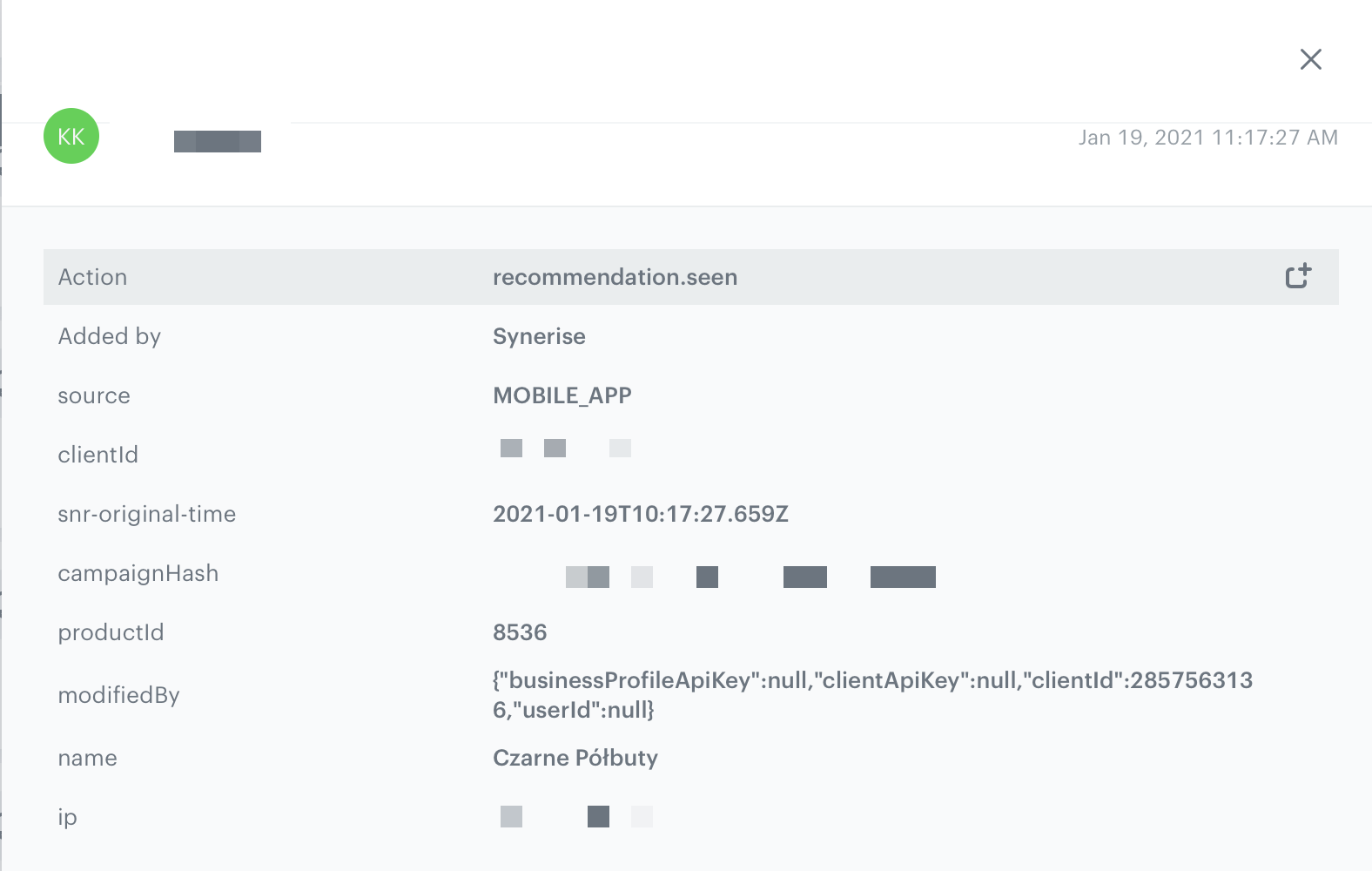
recommendation.seenorrecommendation.view(depending on configuration) sent when a recommended item is visible to the customer.
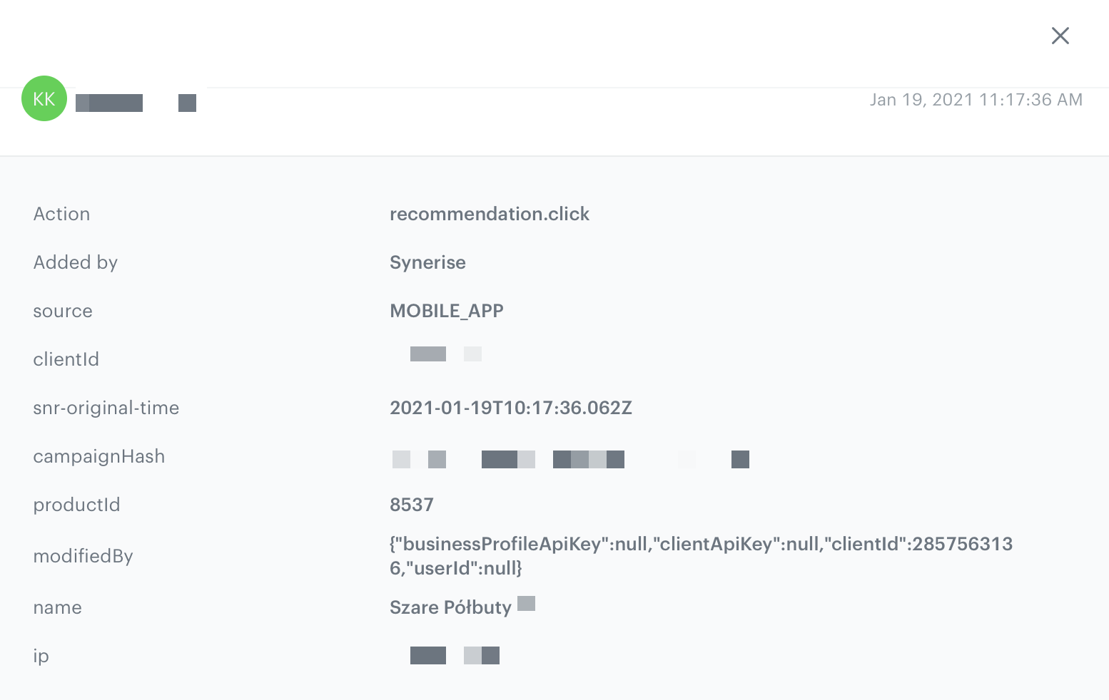
recommendation.clicksent when a customer clicks the recommended item.
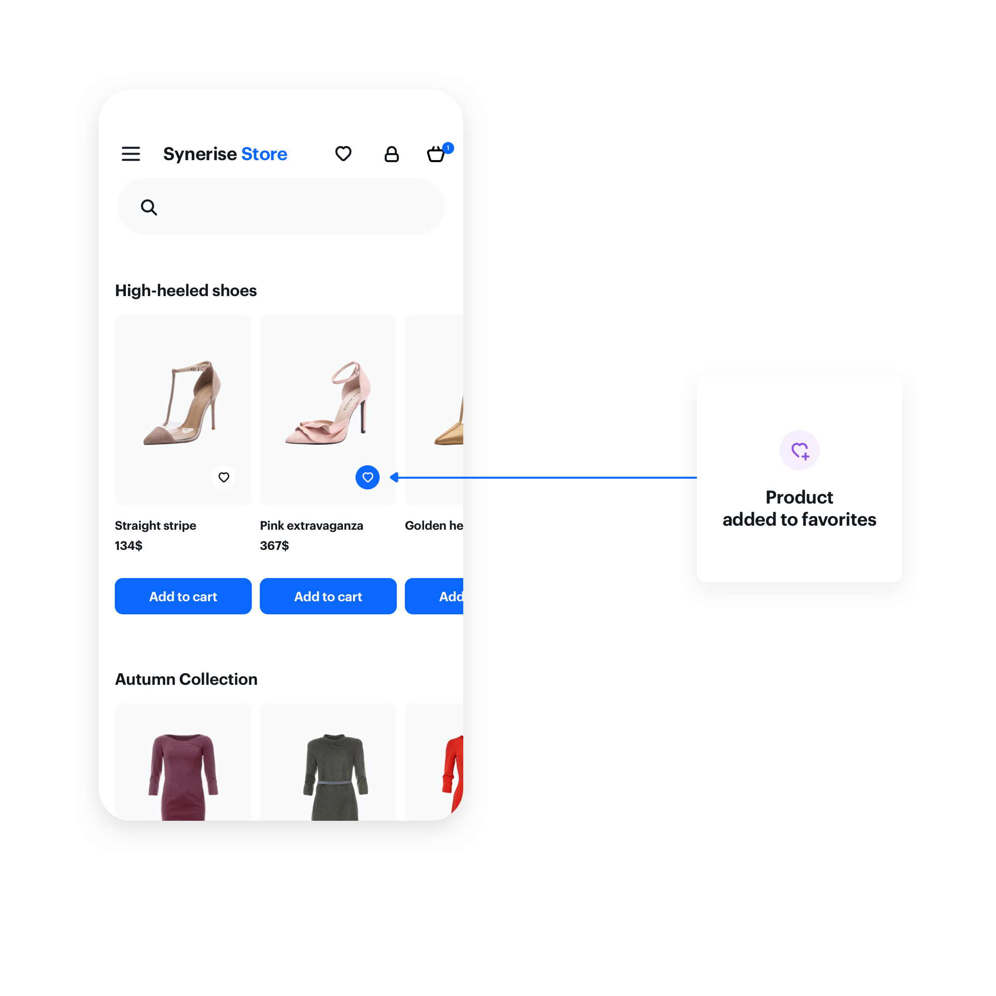
product.likesent when a customer clicks a selectable button in the recommendation. (The button must be added)
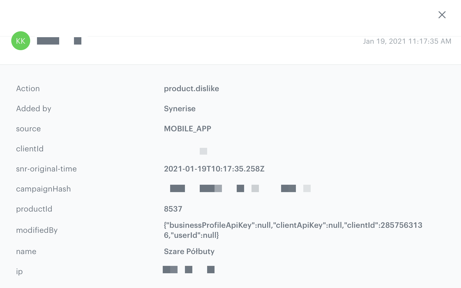
product.dislikesent when a customer clicks a selectable button in the recommendation a second time. (The button must be added)
Prerequisites
To use the content widget feature, you must:
-
Obtain a customer token from Customer Authentication.
-
Create a document.
Such a document should contain the following content:{ "name": "Similar Products", "recommendations": "{% recommendations_json3 campaignId=COhsCCOdu8Cg %} {% endrecommendations_json3 %}" } -
In the notepad, save the document’s slug and the ID of the recommendation for later use.
product-details, menu, and so on.Basic implementation
Configure the ContentWidgetOptions and ContentWidgetAppearance settings first.
| Class | Description |
|---|---|
ContentWidgetOptions |
ContentWidgetOptions contains options for business logic, such as the slug, product identifier, and so on. Read more. |
ContentWidgetAppearance |
ContentWidgetAppearance contains the UI configuration. Read more. |
The example below is the most basic implementation.
let options = ContentWidgetOptions()
options.slug = "similar"
options.mapping = { model in
	guard let imageURLString = model.attributes["imageLink"] as? String,
				let imageURL = URL(string: imageURLString),
				let title = model.attributes["title"] as? String,
				let priceDictionary = model.attributes["price"] as? [AnyHashable: Any],
				let priceValue = priceDictionary["value"] as? Double
	else {
		return nil
	}

	let dataModel = ContentWidgetRecommendationDataModel(imageURL: imageURL, title: title, priceCurrency: "PLN", price: NSNumber(value: priceValue), salePrice: nil)

	if let salePriceDictionary = model.attributes["salePrice"] as? [AnyHashable: Any],
		let salePriceValue = salePriceDictionary["value"] as? Double {
		dataModel.salePriceValue = NSNumber(floatLiteral: salePriceValue)
	}

	let badgeDataModel = ContentWidgetBadgeDataModel(backgroundColor: UIColor.black, textColor: UIColor.white, text: "Black Week")
	dataModel.badge = badgeDataModel

	return dataModel
}

let gridLayout = ContentWidgetGridLayout()
let itemLayout = ContentWidgetBasicProductItemLayout()
let appearance = ContentWidgetAppearance(widgetLayout: gridLayout, itemLayout: itemLayout)

let widget = ContentWidget(options: options, appearance: appearance)

let widgetView = widget.getView()
widgetView.frame = CGRect(x: 0, y: 0, width: UIScreen.main.bounds.size.width, height: UIScreen.main.bounds.size.height)

view.addSubview(widgetView)
Options
The ContentWidgetRecommendationsOptions class is responsible for defining the business logic options of the widget, for example:
- slug of the document
- product identifier
- recommendation data model mapper
The table explains the parameters that can be configured in ContentWidgetRecommendationsOptions.
| Parameter | Type | Default | Description |
|---|---|---|---|
| slug | String |
nil | Slug responsible for generating data |
| productID | String |
nil | Product identifier for generating data |
| mapping | ((ContentWidgetRecommendationModel) -> (ContentWidgetRecommendationDataModel?)) |
nil | Mapping block responsible for mapping data from the feed to a ContentWidgetRecommendationDataModel |
| recommendationEventType | ContentWidgetRecommendationEventType |
- | Recommendation event type.
|
let widgetOptions = ContentWidgetRecommendationsOptions()
widgetOptions.slug = "similar"
widgetOptions.productID = "12345"
widgetOptions.mapping = { model in
	guard let imageURLString = model.attributes["imageLink"] as? String,
				let imageURL = URL(string: imageURLString),
				let title = model.attributes["title"] as? String,
				let priceDictionary = model.attributes["price"] as? [AnyHashable: Any],
				let priceValue = priceDictionary["value"] as? Double
	else {
		return nil
	}

	let dataModel = ContentWidgetRecommendationDataModel(imageURL: imageURL, title: title, priceCurrency: "PLN", price: NSNumber(value: priceValue), salePrice: nil)

	if let salePriceDictionary = model.attributes["salePrice"] as? [AnyHashable: Any],
		let salePriceValue = salePriceDictionary["value"] as? Double {
		dataModel.salePriceValue = NSNumber(floatLiteral: salePriceValue)
	}

	let badgeDataModel = ContentWidgetBadgeDataModel(backgroundColor: UIColor.black, textColor: UIColor.white, text: "Black Week")
	dataModel.badge = badgeDataModel

	return dataModel
}
Appearance
The ContentWidgetAppearance class is responsible for defining the appearance of the widget.
The class consists of parameters that define the widget’s appearance, however, two of them are the most important:
- Main layout class: defines the way of distributing elements in the widget. Currently, two layouts are provided:
ContentWidgetHorizontalSliderLayoutandContentWidgetGridLayout. - Item layout class: defines appearance and parameters for the item in the widget. Currently, there is only one layout provided:
ContentWidgetBasicProductItemLayout.
The table explains the parameters that can be configured in ContentWidgetAppearance.
| Parameter | Type | Default | Description |
|---|---|---|---|
| layout | ContentWidgetLayout |
- | Class that inherits from ContentWidgetLayout contains the UI details of widgetLayout |
| itemLayout | ContentWidgetItemLayout |
- | Class that inherits from ContentWidgetItemLayout contains the UI details of a single item in a widget |
Widget layouts
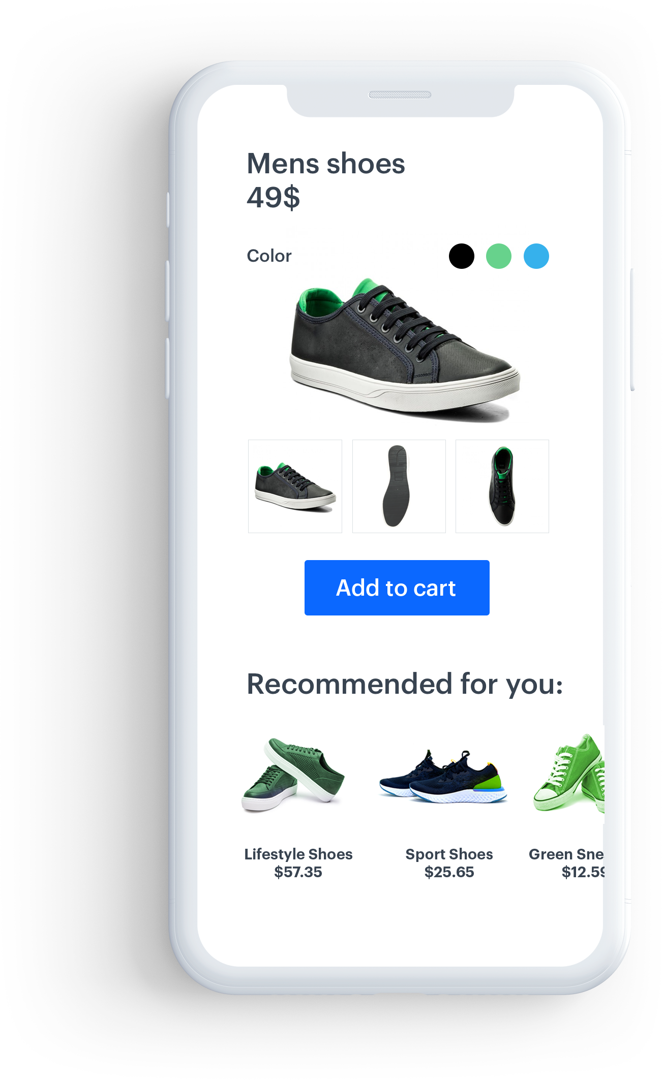
Horizontal Slider
This layout is intended to present recommendations in a fixed-hight horizontal scrollable slider.
Example widget configuration with horizontal slider:
Parameters
The table explains the parameters of SNRContentWidgetHorizontalLayout.
| Property | Type | Default | Description |
|---|---|---|---|
| backgroundColor | UIColor |
UIColor.clearColor | Background color of a widget |
| insets | UIEdgeInsets |
(8.0, 8.0, 8.0, 8.0) | Inner widget margins in pt |
| itemSize | CGSize |
(150.0, 200.0) | Size of a single item in pt |
| itemSpacing | CGFloat |
16.0 | Horizontal spacing between items in pt |
| numberOfItems | Int |
- | A read-only property. It returns the number of items after a widget is loaded |
Example
let horizontalSliderLayout = ContentWidgetHorizontalSliderLayout()
horizontalSliderLayout.insets = UIEdgeInsets(top: 16.0, left: 16.0, bottom: 16.0, right: 16.0)
horizontalSliderLayout.itemSize = CGSize(width: 150, height: 350)
horizontalSliderLayout.itemSpacing = 8.0
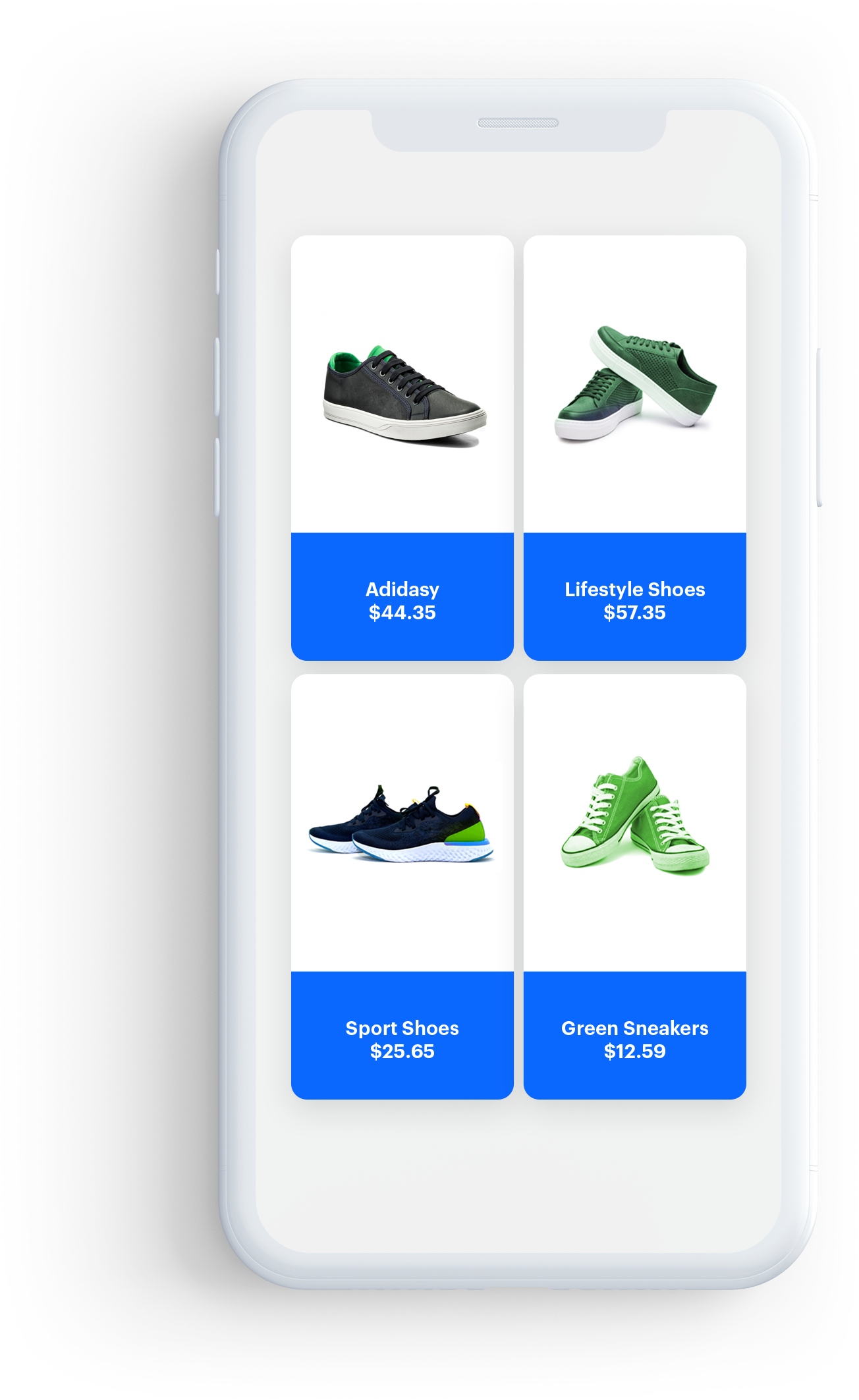
Grid View
This layout presents recommendations in a vertical scrollable grid, with elements organized into columns and rows. You can create a full- or half-screen widget.
Example widget configuration with grid layout:
Parameters
The table explains the parameters of the grid layout.
| Property | Type | Default | Description |
|---|---|---|---|
| backgroundColor | UIColor |
UIColor.clearColor | Background color of a widget |
| insets | UIEdgeInsets |
(8.0, 8.0, 8.0, 8.0) | Inner widget margins in pt |
| itemSize | CGSize |
(150.0, 200.0) | Size of a single item in pt |
| itemHorizontalSpacing | CGFloat |
16.0 | Horizontal spacing between items in pt |
| itemVerticalSpacing | CGFloat |
16.0 | Vertical spacing between items in pt |
| numberOfItems | Int |
- | A read-only property. It returns the number of items after the widget is loaded |
Example
let gridLayout = ContentWidgetGridLayout()
gridLayout.insets = UIEdgeInsets(top: 16.0, left: 16.0, bottom: 16.0, right: 16.0)
gridLayout.itemSize = CGSize(width: 150, height: 350)
gridLayout.horizontalItemSpacing = 8.0
gridLayout.verticalItemSpacing = 8.0
Widget Item layouts
Basic Product Item Layout
This is the basic layout for items. It contains: the image, the title, and the price from the uploaded data.
Parameters
The table below contains all parameters you can configure in the basic item layout.
| Property | Type | Default | Description |
|---|---|---|---|
| backgroundColor | UIColor |
UIColor.whiteColor | Background color of an item |
| cornerRadius | CGFloat |
0.0 | Radius of the item corners |
| borderWidth | CGFloat |
0.0 | Width of the item’s border |
| borderColor | CGFloat |
nil | Color of the item’s border |
| shadowColor | UIColor |
nil | Color of the item’s shadow |
| imageWidthRatio | CGFloat |
1.0 | Image width. A ratio of 1.0 means that the image width equals to 100% of the entire height of the item |
| imageHeightRatio | CGFloat |
0.35 | Image height. A ratio of 0.35 means that image height equals to 35% of the entire height of the item |
| imageBackground | UIColor |
UIColor.clearColor | Background color of the image |
| imageContentMode | UIViewContentMode |
UIViewContentMode.scaleToFill | Display content mode of the image |
| topTextInsets | UIEdgeInsets |
(8.0, 8.0, 8.0, 8.0) | Inner margins of the top text label |
| topTextFont | UIFont |
UIFont.systemFont(ofSize: 16.0) | Font of the top text label |
| topTextFontColor | UIColor |
UIColor.blackColor | Color of the top text label |
| topTextAlignment | NSTextAlignment |
NSTextAlignment.center | Alignment of the top text label |
| titleInsets | UIEdgeInsets |
(8.0, 8.0, 8.0, 8.0) | Inner margins of the title label |
| titleFont | UIFont |
UIFont.systemFont(ofSize: 16.0) | Font of the title label |
| titleFontColor | UIColor |
UIColor.blackColor | Color of the title label |
| titleAlignment | NSTextAlignment |
NSTextAlignment.center | Alignment of the title label |
| subtitleInsets | UIEdgeInsets |
(8.0, 8.0, 8.0, 8.0) | Inner margins of the subtitle label |
| subtitleFont | UIFont |
UIFont.systemFont(ofSize: 16.0) | Font of the subtitle label |
| subtitleFontColor | UIColor |
UIColor.blackColor | Color of the subtitle label |
| subtitleAlignment | NSTextAlignment |
NSTextAlignment.center | Alignment of the subtitle label |
| identifierInsets | UIEdgeInsets |
(8.0, 8.0, 8.0, 8.0) | Inner margins of the identifier label |
| identifierFont | UIFont |
UIFont.systemFont(ofSize: 16.0) | Font of the identifier label |
| identifierFontColor | UIColor |
UIColor.blackColor | Color of the identifier label |
| identifierAlignment | NSTextAlignment |
NSTextAlignment.center | Alignment of the identifier label |
| priceInsets | UIEdgeInsets |
(8.0, 8.0, 8.0, 8.0) | Inner margins of the price label |
| priceFont | UIFont |
UIFont.systemFont(ofSize: 14.0) | Font of the price label |
| priceFontColor | UIColor |
UIColor.blackColor | Color of the price label |
| priceAlignment | NSTextAlignment |
NSTextAlignment.center | Alignment of the price label |
| priceGroupSeparator | String |
nil | Separator of price group |
| priceDecimalSeparator | String |
nil | Separator of price decimal |
| priceCurrencyPosition | ContentWidgetPriceCurrencyPosition |
.right | Determines the side on which the price currency is |
| isSalePriceVisible | Bool |
true | Flag determining whether to show the sale price label or not |
| salePriceOrientation | UILayoutConstraintAxis |
UILayoutConstraintAxis.Horizontal | Orientation of the sale price label |
| isDiscountPercentageVisible | Bool |
true | Flag determining whether to show the discount percentage label or not |
| discountPercentageFont | UIFont |
UIFont.systemFont(ofSize: 10.0) | Font of the discount percentage label |
| discountPercentageFontColor | UIColor |
UIColor.blackColor | Font of the discount percentage label |
| regularPriceFont | UIFont |
nil | Font of the regular price label |
| regularPriceFontColor | UIColor |
nil | Color of the sale regular label |
| salePriceFont | UIFont |
nil | Font of the sale price label |
| salePriceFontColor | UIColor |
nil | Color of the sale price label |
| loyaltyPointsInsets | UIEdgeInsets |
(8.0, 8.0, 8.0, 8.0) | Inner margins of the loyalty points label |
| loyaltyPointsAlignment | NSTextAlignment |
NSTextAlignment.left | Alignment of the loyalty points label |
| loyaltyPointsNumberFont | UIFont |
UIFont.systemFont(ofSize: 16.0) | Font of the loyalty points number label |
| loyaltyPointsNumberFontColor | UIColor |
UIColor.blackColor | Color of the loyalty points number label |
| loyaltyPointsTextFont | UIFont |
UIFont.systemFont(ofSize: 16.0) | Font of the loyalty points text label |
| loyaltyPointsTextFontColor | UIColor |
UIColor.blackColor | Color of the loyalty points text label |
| loyaltyPointsText | UIFont |
‘Loyalty points’ | Text after the number of loyalty points |
| badge | SNRContentWidgetBadgeItemLayoutPartial |
nil | Optional badge view |
| actionButton | SNRContentWidgetImageButtonCustomAction |
nil | Optional button for your own custom action |
Example
let itemLayout = ContentWidgetBasicProductItemLayout()
itemLayout.imageWidthRatio = 1.0
itemLayout.imageHeightRatio = 0.4
itemLayout.borderWidth = 2.0
itemLayout.borderColor = UIColor.black
itemLayout.shadowColor = UIColor.black
itemLayout.cornerRadius = 12.0
Interaction with the Widget
Public Interface
load() - Starts fetching data and creates a view structure of the widget.
isLoaded() - Checks whether the widget is successfully loaded.
getView() - Gets the root view of the whole widget view structure.
Delegation
ContentWidgetDelegate is used to inform developers about the state of a widget.
snr_widgetIsLoading(widget:isLoading:)- Called when the widget’s loading state changes. It’s an optional method.snr_widgetDidLoad(widget:)- Called after the widget is loaded. It’s a required method.snr_widgetDidNotLoad(widget:error:)- Called when an error occurs while loading. It’s a required method.snr_widgetDidChangeSize(widget:size:)- Called when the widget size changes. It’s an optional method.snr_widgetDidReceiveClickAction(widget:model:)- Called when the customer clicks a widget item. It’s a required method.
ContentWidgetDelegate section for more details.Image Button Custom Action
ContentWidgetImageButtonCustomAction is used to add an image button to your widget (only if the item layout allows). You can add a button with a single state or make it selectable.
Parameters
| Property | Type | Default | Description |
|---|---|---|---|
| predefinedActionType | ContentWidgetBaseCustomActionPredefiniedActionType |
.none | It determines which event is sent on click |
| size | CGSize |
CGSize.Zero | Button size |
| position | CGPoint |
CGPoint.Zero | Position |
| backgroundColor | UIColor |
UIColor.clearColor | Background color of the button |
| tintColor | UIColor |
UIColor.blackColor | Fill color of the button’s image, if an asset supports it |
| image | UIImage |
nil | Button image |
| isSelectable | Bool |
nil | Flag determining whether the button is selectable |
| selectedImage | UIImage |
nil | Image of the button when the button is selected |
| isSelected | SNRContentWidgetImageButtonCustomActionIsSelectedBlock |
nil | Block/closure to be executed when the widget needs to determine the state of a button in the cell |
| onReceiveClickAction | SNRContentWidgetImageButtonCustomActionReceiveClickActionBlock |
nil | Block/closure to be executed when the button is clicked |
Block/Closures
isSelected- Called when the widget tries to determine button’s state. The only one parameter is model of data for the cell (for exampleRecommendation). It’s an optional property.onReceiveClickAction- Called when the button was clicked. Parameters are model of data for the cell (for exampleRecommendation) and current state of button. It’s an optional property.
Sample Implementations
Horizontal Slider
This is an example with ContentWidgetHorizontalSliderLayout. It always has fixed height, so after the widget is loaded, its content height can be calculated.
That is why it is done in the snr_widgetDidLoad(widget:) method.
The widget content size in a horizontal slider layout can be calculated by the getSize() method.
class ContentWidgetHorizontalSliderSampleViewController: UIViewController, ContentWidgetDelegate {

	var widget: ContentWidget!

    @IBOutlet weak var widgetContainerView: UIView!

	// MARK: - Lifecycle

	override func viewDidLoad() {
		super.viewDidLoad()

		setupWidget()
	}

	// MARK: - Private

	func setupWidget() -> Void {
		let options = ContentWidgetRecommendationsOptions()
		options.slug = "similar"
		options.productID = "12345"
		options.mapping = { model in
			guard let imageURLString = model.attributes["imageLink"] as? String,
						let imageURL = URL(string: imageURLString),
						let title = model.attributes["title"] as? String,
						let priceDictionary = model.attributes["price"] as? [AnyHashable: Any],
						let priceValue = priceDictionary["value"] as? Double
			else {
				return nil
			}

			let dataModel = ContentWidgetRecommendationDataModel(imageURL: imageURL, title: title, priceCurrency: "PLN", price: NSNumber(value: priceValue), salePrice: nil)

			if let salePriceDictionary = model.attributes["salePrice"] as? [AnyHashable: Any],
				let salePriceValue = salePriceDictionary["value"] as? Double {
				dataModel.salePriceValue = NSNumber(floatLiteral: salePriceValue)
			}

			let badgeDataModel = ContentWidgetBadgeDataModel(backgroundColor: UIColor.black, textColor: UIColor.white, text: "Black Week")
			dataModel.badge = badgeDataModel

			return dataModel
		}

		let horizontalSliderLayout = ContentWidgetHorizontalSliderLayout()
		horizontalSliderLayout.insets = UIEdgeInsets(top: 16.0, left: 16.0, bottom: 16.0, right: 16.0)
		horizontalSliderLayout.itemSize = CGSize(width: 150, height: 350)
		horizontalSliderLayout.itemSpacing = 8.0

		let itemLayout = ContentWidgetBasicProductItemLayout()
		itemLayout.imageWidthRatio = 1.0
		itemLayout.imageHeightRatio = 0.4
		itemLayout.borderWidth = 2.0
		itemLayout.borderColor = UIColor.black
		itemLayout.shadowColor = UIColor.black
		itemLayout.cornerRadius = 12.0

		let actionButton = ContentWidgetImageButtonCustomAction()
		actionButton.backgroundColor = UIColor.clear
		actionButton.tintColor = UIColor.black
		actionButton.image = UIImage(imageLiteralResourceName: "Shop Flow/icon_favorite_add")
		actionButton.isSelectable = true
		actionButton.selectedImage = UIImage(imageLiteralResourceName: "Shop Flow/icon_favorite_remove")
		actionButton.size = CGSize(width: 40, height: 40)
		actionButton.predefinedActionType = .sendLikeEvent
		actionButton.onReceiveClickAction = {
			model, isSelected in

			if let recommendationModel = model as? Recommendation {
				print("Content Widget did receive click action for action button \(recommendationModel.title)")
			}
		}
		actionButton.isSelected = {
			model in

			return false
		}

		itemLayout.actionButton = actionButton
		itemLayout.actionButtonPosition = CGPoint(x: (150.0 - 40 - 8), y: 8)

		let appearance = ContentWidgetAppearance(widgetLayout: horizontalSliderLayout, itemLayout: itemLayout)

		widget = ContentWidget(options: options, appearance: appearance)
		widget.delegate = self
		widget.load()
	}

	// MARK: - ContentWidgetDelegate

	func snr_widgetIsLoading(widget: ContentWidget, isLoading: Bool) {
		print("Content Widget is loading: \(isLoading)")
	}

	func snr_widgetDidLoad(widget: ContentWidget) {
		print("Content Widget did load")

		let widgetView: UIView = widget.getView()
		let widgetSize: CGSize = (widget.layout as! ContentWidgetHorizontalSliderLayout).getSize()

		widgetContainerView.addSubview(widgetView)

		widgetView.translatesAutoresizingMaskIntoConstraints = false
		widgetView.topAnchor.constraint(equalTo: widgetContainerView.topAnchor).isActive = true
		widgetView.bottomAnchor.constraint(equalTo: widgetContainerView.bottomAnchor).isActive = true
		widgetView.leftAnchor.constraint(equalTo: widgetContainerView.leftAnchor).isActive = true
		widgetView.rightAnchor.constraint(equalTo: widgetContainerView.rightAnchor).isActive = true

		widgetContainerView.heightAnchor.constraint(equalToConstant: widgetSize.height).isActive = true
	}

	func snr_widgetDidNotLoad(widget: ContentWidget, error: Error) {
		print("Content Widget did not load. Error: \(error.localizedDescription)")
	}

	func snr_widgetDidChangeSize(widget: ContentWidget, size: CGSize) {
		print("Content Widget did change size to: \(size)")
	}

	func snr_widgetDidReceiveClickAction(widget: ContentWidget, model: BaseModel) {
		if let recommendationModel = model as? Recommendation {
			print("Content Widget did receive click action for \(recommendationModel.title)")
		}
	}
}
Grid View
A basic example with ContentWidgetGridLayout and UITableViewController. Remember that cells are prototyped.
Initially, the height of the tenth row equals zero, because there is no possibility of getting the correct height of the widget. Before the widget is loaded, we don’t know how many items it’s going to contain.
The widget view is flexible, so it fits the dimensions that you set up. If the height of the widget that you set is smaller than the total height of the generated grid, the content can be scrolled vertically.
The grid’s content height depends on:
- The widget width that you set up
- The number of items that have been loaded
That is why the code below reloads the tenth row after the widget is loaded. Earlier, it was impossible to calculate the height correctly.
In addition, the widget row is reloaded when the snr_widgetDidChangeSize(widget:size:) method is called. In this case, it’s a required action, because the widget has pinned constraints to superview in a prototyped cell.
The widget’s content size changes with the tableview size, for example when the screen orientation changes, the widget’s height needs to be re-calculated. Otherwise, the cell height may be larger that necessary.
The total widget content size in a grid layout can be calculated by the getSize(preferredWidth:) method.
class ContentWidgetGridViewSampleViewController: UITableViewController, ContentWidgetDelegate {

	var widget: ContentWidget!

    @IBOutlet weak var widgetContainerView: UIView!

	// MARK: - Lifecycle

	override func viewDidLoad() {
		super.viewDidLoad()

		setupWidget()
	}

	func setupWidget() -> Void {
		let options = ContentWidgetRecommendationsOptions()
		options.slug = "similar"
		options.productID = "12345"
		options.mapping = { model in
			guard let imageURLString = model.attributes["imageLink"] as? String,
						let imageURL = URL(string: imageURLString),
						let title = model.attributes["title"] as? String,
						let priceDictionary = model.attributes["price"] as? [AnyHashable: Any],
						let priceValue = priceDictionary["value"] as? Double
			else {
				return nil
			}

			let dataModel = ContentWidgetRecommendationDataModel(imageURL: imageURL, title: title, priceCurrency: "PLN", price: NSNumber(value: priceValue), salePrice: nil)

			if let salePriceDictionary = model.attributes["salePrice"] as? [AnyHashable: Any],
				let salePriceValue = salePriceDictionary["value"] as? Double {
				dataModel.salePriceValue = NSNumber(floatLiteral: salePriceValue)
			}

			let badgeDataModel = ContentWidgetBadgeDataModel(backgroundColor: UIColor.black, textColor: UIColor.white, text: "Black Week")
			dataModel.badge = badgeDataModel

			return dataModel
		}

		let gridLayout = ContentWidgetGridLayout()
		gridLayout.insets = UIEdgeInsets(top: 16.0, left: 16.0, bottom: 16.0, right: 16.0)
		gridLayout.itemSize = CGSize(width: 150.0, height: 350.0)
		gridLayout.horizontalItemSpacing = 8.0
		gridLayout.verticalItemSpacing = 8.0

		let itemLayout = ContentWidgetBasicProductItemLayout()
		itemLayout.imageWidthRatio = 1.0
		itemLayout.imageHeightRatio = 0.4
		itemLayout.borderWidth = 2.0
		itemLayout.borderColor = UIColor.black
		itemLayout.shadowColor = UIColor.black
		itemLayout.cornerRadius = 12.0

		actionButton.onReceiveClickAction = {
			model, isSelected in

			if let recommendationModel = model as? Recommendation {
				print("Content Widget did receive click action for action button \(recommendationModel.title)")
			}
		}
		actionButton.isSelected = {
			model in

			return false
		}

		itemLayout.actionButton = actionButton
		itemLayout.actionButtonPosition = CGPoint(x: (150.0 - 40.0 - 8.0), y: 8.0)

		let appearance = ContentWidgetAppearance(widgetLayout: gridLayout, itemLayout: itemLayout)

		widget = ContentWidget(options: options, appearance: appearance)
		widget.delegate = self
		widget.load()
	}

	// MARK: - UITableViewDataSource, UITableViewDelegate

	override func tableView(_ tableView: UITableView, numberOfRowsInSection section: Int) -> Int {
		return 10
	}

	override func tableView(_ tableView: UITableView, heightForRowAt indexPath: IndexPath) -> CGFloat {
		if indexPath.row == 10 {
			if widget != nil && widget.isLoaded() {
				return (widget.layout as! ContentWidgetGridLayout).getSize(preferredWidth: tableView.bounds.size.width).height
			} else {
				return 0
			}
		}

		return 100.0
	}

	// MARK: - ContentWidgetDelegate

	func snr_widgetIsLoading(widget: ContentWidget, isLoading: Bool) {
		print("Content Widget is loading: \(isLoading)")
	}

	func snr_widgetDidLoad(widget: ContentWidget) {
		print("Content Widget did load")

		view.addSubview(widgetView)

		widgetView = widget.getView()
		widgetContainerView.addSubview(widgetView)

		widgetView.translatesAutoresizingMaskIntoConstraints = false
		widgetView.topAnchor.constraint(equalTo: widgetContainerView.topAnchor).isActive = true
		widgetView.bottomAnchor.constraint(equalTo: widgetContainerView.bottomAnchor).isActive = true
		widgetView.leftAnchor.constraint(equalTo: widgetContainerView.leftAnchor).isActive = true
		widgetView.rightAnchor.constraint(equalTo: widgetContainerView.rightAnchor).isActive = true

		tableView.reloadData()
	}

	func snr_widgetDidNotLoad(widget: ContentWidget, error: Error) {
		print("Content Widget did not load. Error: \(error.localizedDescription)")
	}

	func snr_widgetDidChangeSize(widget: ContentWidget, size: CGSize) {
		print("Content Widget did change size to: \(size)")

		tableView.reloadData()
	}

	func snr_widgetDidReceiveClickAction(widget: ContentWidget, model: BaseModel) {
		if let recommendationModel = model as? Recommendation {
			print("Content Widget did receive click action for \(recommendationModel.title)")
		}
	}
}
More information
You can find more information under the following links: